
Landing Page Documentation
Landing Page Documentation
How to use the banner
The banner takes the Title and Overview from the edit/metadata edit screen and uses it. If you want to update them, you'll have to go back to the edit/metadata page.
It allows for:
- Overwriting the title
- Banner options
- Layout
- Columned
- Full-width
- Shifting image to the left
- Layout
- Image
- Call to action (CTA)
We encourage you to leave the banner on the landing page to help users identify where they are.
How to start adding content
To add content to your new Landing, you'll need to add the metadata when adding a new landing.
Metadata
- Title
- Overview
Title
The main title of the content. It's required for all content.
Overview
A short summary of the content. This shows up on the Page and in search results. It's essential to add this for search engine optimization and federated search. Keep it short, and descriptive as possible.f
Adding content
After you save the page, you'll see the title and overview show up on the page. To add content to the page, you need to use Layout. This will give you the ability to add sections and blocks.
Sections
You can think of your content in rows. The section sets up a row of content. You will have these choices:
- Layout
- Administrative label
- Style
Layout
You can choose between 1-4 columned layouts. You can add components to each of the columns. They can be moved between columns.
Administrative label
You don't need to fill this out, but it is helpful for other editors to know what this section is for. Use a descriptive label, e.g. List of News Articles or Our Areas of Focus.
Style
Allows editors to assign a background color based on the color theme you choose in settings. White is the default. Here are the other choices:
- Light Gray Background – Universal light gray
- Light Color Background – The lightest color based on the theme
- Medium Color Background – The medium color based on the theme
- Dark Color Background – The darkest color based on the theme
- Navy Background – Universal navy
Basic Text Block
The Basic Text Block is the most-used component. It's a basic text area with a title. Use this for all content that doesn't need a special design component.
Accordions
Accordions allow edtors to long lists of content in a easy-to-scan format. Accordions should only be used for content like FAQs. The Accordion Title should have enough information that the Accordion Body doesn't need to be shown for users to know what's inside. Please don't use these because you want a shorter page. It hides content and users love to scroll and use search for their keywords. If you hide it, they can't find it. It's a major accessibility issue for users with assistive devices.
Lorem ipsum dolor sit amet consectetur adipiscing elit. Quisque faucibus ex sapien vitae pellentesque sem placerat. In id cursus mi pretium tellus duis convallis. Tempus leo eu aenean sed diam urna tempor. Pulvinar vivamus fringilla lacus nec metus bibendum egestas. Iaculis massa nisl malesuada lacinia integer nunc posuere. Ut hendrerit semper vel class aptent taciti sociosqu. Ad litora torquent per conubia nostra inceptos himenaeos.
Lorem ipsum dolor sit amet consectetur adipiscing elit. Quisque faucibus ex sapien vitae pellentesque sem placerat. In id cursus mi pretium tellus duis convallis. Tempus leo eu aenean sed diam urna tempor. Pulvinar vivamus fringilla lacus nec metus bibendum egestas. Iaculis massa nisl malesuada lacinia integer nunc posuere. Ut hendrerit semper vel class aptent taciti sociosqu. Ad litora torquent per conubia nostra inceptos himenaeos.
Biography Cards
You can add a grouping of biography cards for UCSF Person content type. You can add 1 - unlimited.
-

Joel W. Gonzales
Admissions Director
As a member of the Office of Student Affairs (OSA), I oversee PharmD admissions, coordinate the activities of the Admissions Committee, and manage the annual selection of entering pharmacy students. I am involved in all aspects of recruitment and outreach for the UCSF School of Pharmacy and speak… -

Su Guo, PhD
Professor
I am interested in how genes regulate brain development and behavior and ultimately impact neuropsychiatric disorders.As director of the Center for Collaborative Innovation, I lead efforts to increase collaboration between clinical, translational, and discovery science in teaching and research.Learn more about Su Guo, PhD -

Andrej Sali, PhD
Professor
I am interested in the structure, function, and evolution of proteins and their assemblies.Learn more about Andrej Sali, PhD
Gallery
Galleries are used to group images and give a way for users to browser through them.

This is a caption for the image. It can include photo credits and links to other information.

This is a caption for the image. It can include photo credits and links to other information.
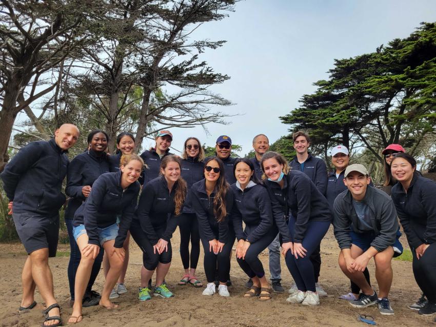
This is a caption for the image. It can include photo credits and links to other information.
Icon Cards
Icon cards can be added as a grouping, with a title and overview text. Each card consists of an optional icon, title, overview, and a call to action (CTA). Keep titles and overviews short and concise. The CTA should be more than "read more", it should be able to stand alone as a descriptive link, e.g. "read about our faculty".
-

Title for card
When adding a new icon, add the media tag "icon" and "Icon" to the name of the file. This will help you search for them better.
-

Another icon card title
When creating new icons with templates, you can look at Brand Identity Iconography guidelines page.
-

This is a icon card title
Brand Identity is working on a new icon library. When it's available, we'll link it here. We use the DinosoftLabs Noun Project and Font Awesome to get icons now.
Eyebrow
In-Page Promotional Banner

News Card
This component allows you to add one news card at a time. This is a good time to use different layouts, 2-4 columns, to place news items that are not dynamic. They will stay until you change them.

Quick Links
Quick Links is used for a list of links that need to be grouped. Has a title, overview, and list of links. Use Resource Cards over Icon Cards when you need a list of resources that do not need a lot of context or guidance for the user before they click.
Resource Cards
Resource Cards are used when your links to resources needs a bit more context for users to know where the link goes. It includes a grouping of resources links with a title, overview, and each card has a resource and an overview. We'd prefer for you to use this for lists of links. It will also increase your search engine optimization!
-
This is a link to a resource
Lorem ipsum dolor sit amet consectetur adipiscing elit. Quisque faucibus ex sapien vitae pellentesque sem placerat.
-
This is the title of another resource
It's good to have an overview to give more context to where this link will go and why they should visit it.
-
Short title
By giving more information before the user clicks, we can also give context for when they land on a new website. Example, fill out the form on this page to get help.
Statistic Card
100%
Of our editors are awesome people! Consists of a stat, and an overview to describe stat. Includes bold, italics, and links.
Statistic Card
1 Card!
This pattern, like New Card, had only one card at a time!
Statistic Card
We love Columns!
Use these cards with the section layouts, 1-4 columns, to give a custom set of cards. You can also use the next to other components.
Steps
Steps should be used to give users a listing of things to do in order. It is grouped with a title and overview text, and each step consists of a title, body text, and a call to action (CTA) that includes an icon, link, and title.
Step1
First step in an unlimited amount of steps
Step body allows, bold, italics, links, lists, and images!
Call to action linkStep2
Another step
Lorem ipsum dolor sit amet consectetur adipiscing elit. Quisque faucibus ex sapien vitae pellentesque sem placerat. Lorem ipsum dolor sit amet consectetur adipiscing elit. Quisque faucibus ex sapien vitae pellentesque sem placerat.
Step3
Another step in a list of steps
Lorem ipsum dolor sit amet consectetur adipiscing elit. Quisque faucibus ex sapien vitae pellentesque sem placerat. Lorem ipsum dolor sit amet consectetur adipiscing elit. Quisque faucibus ex sapien vitae pellentesque sem placerat. Lorem ipsum dolor sit amet consectetur adipiscing elit. Quisque faucibus ex sapien vitae pellentesque sem placerat.
Testimonial / Quote is a single card that can be used anywhere. It's a great opportunity to add in the sections layout of 1-4 columns.
The testimonial / quote allows for a quote, the name of the person being quoted, and their affiliations.
Dynamic Lists: Recent news
Dynamic list are used to add content that will automatically update with new content. You can choose 1-unlimited news items. They are sorted by newest story.
News
-
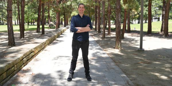
Q&A: Tony Capra on AI, Ancient DNA, and the Future of Genetics
Tony Capra, PhD, first came to UCSF as a postdoctoral fellow, where he learned to apply computational methods to genetics and human evolution. Now a professor in the UCSF School of Pharmacy's Department of Bioengineering and Therapeutic Sciences, Capra develops computational and AI methods to better understand genetic variation, rare disease, and the biology that makes us human.
-
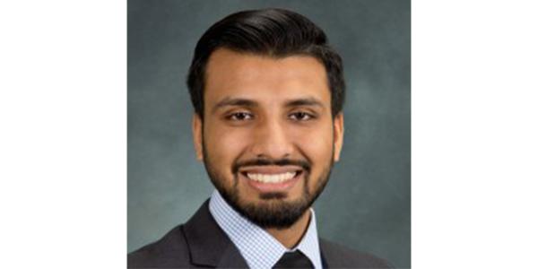
New CPCS Executive Director Brings Public Health Vision
After years leading infectious disease surveillance and outbreak investigations at the Centers for Disease Control and Prevention (CDC), Faisal Minhaj, PharmD, MPH, DABAT, has joined the UCSF School of Pharmacy to lead the California Poison Control System (CPCS), where he sees a unique opportunity to advance public health through research, statewide collaboration, and patient care.
-

New Program at UCSF and UC Berkeley Will Drive Advances in Medicine
UC San Francisco and UC Berkeley have launched a joint program to develop the frontier of AI and biomedicine to accelerate advances in clinical care. James Fraser, PhD, a professor in the UCSF School of Pharmacy’s Department of Bioengineering and Therapeutic Sciences, is among the program's leaders.
Dynamic Lists: Recent events
Dynamic list are used to add content that will automatically update with new content. You can choose 1-unlimited event items. They are sorted by event date.
Events
No content.
Lists (Other): UCSF Events Calendar
The UCSF events calendar pulls for calendar.ucsf.edu. It will link to a screen you can configure your list of event based on type, location, etc. This is a dynamic list that will update itself as new events are added and updated.
UCSF Events Calendar
-
2026 PT3 The Interview and Reverse Interview Class at Mission Bay
Classroom Presentation By the end of this class, PT3 students will be able to: - Effectively prepare for an interview - Strategize responses to open-ended and behavioral...
MBA Dissertation Openhouse at UCSF Library
MBA dissertations workshop - Effective every Friday throughout semester times only. This event is supported by the Student Activities Fee as a funded event by the Associated...
2026 PT3 Salary Negotiation Class at Mission Bay
By the end of this class, PT3 students will be able to: - Determine which aspects and supports are important to you in a position and workplace - Initiate and navigate...